Python Applications
The prediction of covid-19 pandemic
The pandemic: the covid-19 pandemic was caused by the pneumonia-causing novel coronavirus (SARS-CoV-2), which has caused lethal respiratory infections in humans in 2020. The coronaviruses may also cause many diseases in animals such as cows, chicken, pigs and birds. The outbreak was believed to be initiated from either a single introduction into humans or very few animal-to-human transmissions (Johns Hopkins Center for Health Security, April 2020).
The viral genome (GenBank Accession: NC_045512): the covid-19 is positive-sense RNA virus and has approximately 25-32 kilobases being the largest genome of RNA viruses with a unique replication capability. Genomic research indicated that two genes, i.e. the S and N genes, are involved in the SARS-CoV-2. High mutation rates of the RNA viruses may result in several slightly different versions of the viral genome whenever the viral genome is replicated, thus creating a new viral population with diverse genomes or, namely, viral quasispecies.
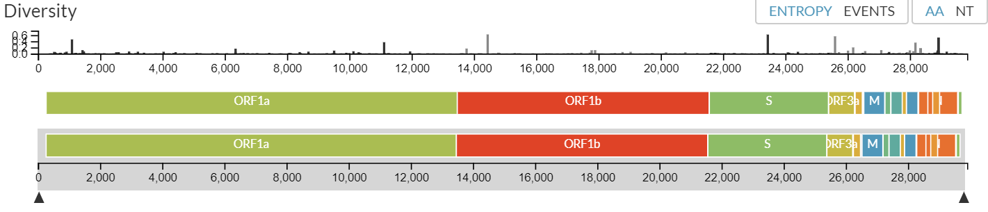
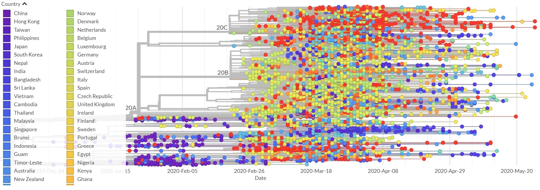
NEXTSTRAIN created a chart below to illustrate the viral genome structural diversity and a phylogeny generated from the genome sequence analysis of samples collected from different countries (nextstrain.org, May 2020).
Diversity of the viral genomes including the open reading frames (ORFs):
A phylogeny from the genome sequence analysis of the (+)ssRNA viruses from many countries:
The genome sequence analysis across samples has demonstrated highest diversity occurring in the structural genes, especially the S protein, ORF3a, and ORF8 (Johns Hopkins Center for Health Security, April 2020).
Another study has reported that selective pressure on the virus may have resulted in mutation based on the analysis of Open Reading Frame 1ab (ORF1ab) of COVID‐2019 and the stabilizing mutation at nsp2 protein has made the COVID‐19 disease being more contagious than SARS (Angeletti et al., J. Med. Virol., Feb. 2020).
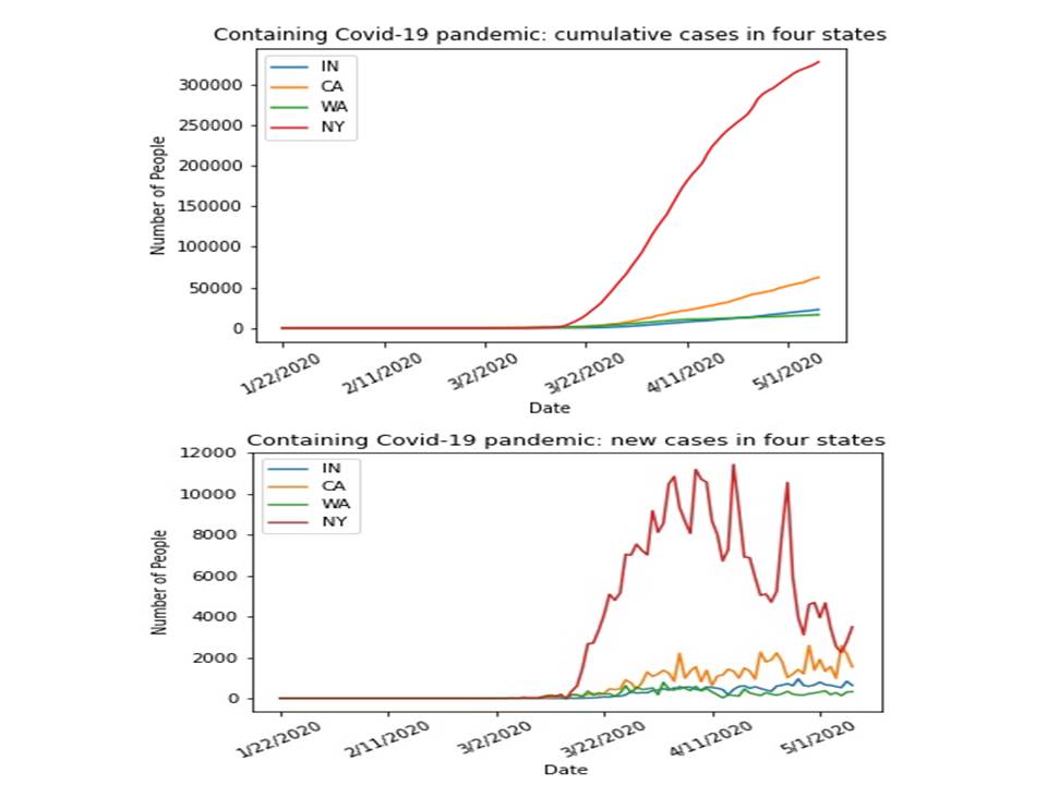
The prediction of covid-19 pandemic: the data were obtained and derived from the Johns Hopkins University and the pandemic prediction was made through the use of a python package, i.e. Prophet. The data visualization and the charts of predictions on the cumulative cases as well as the new cases for some of the States (i.e. WA, CA, IN, NY) and Hubei province are illustrated in the right column.
Also, animated data visualizations are created for cumulative cases and new cases across the states.
Another example in controlling the covid-19 pandemic in the same chart for WA, CA, IN, NY:
Containing the pandemic: by August 17, 2020, the countries that have more than half million confirmed covid-19 cases include USA, Brazil, India, Russia, South Africa, Peru and Mexico based on the cumulative cases and the new cases (Data from Johns Hopkins University, August 2020).
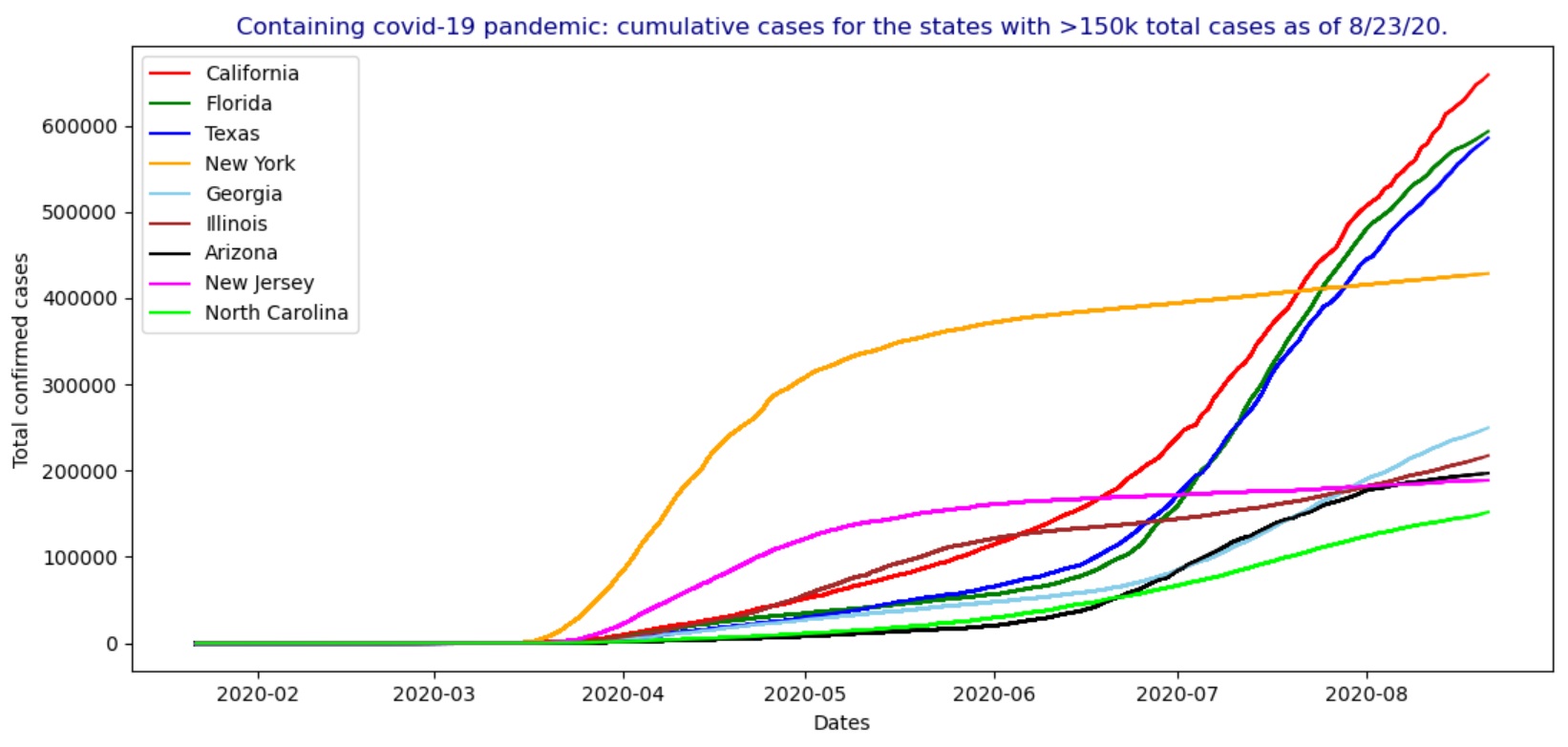
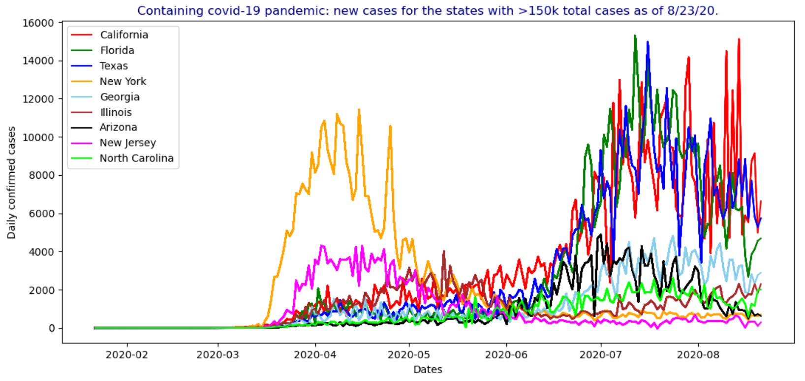
In the USA, by August 23, 2020, the states having more than 150k total confirmed covid-19 cases include California, Florida, Texas, New York, Georgia, Illinois, Arizona, New Jersey and North Carolina as shown in the figures below, including the animated charts for the cumulative cases and new cases.
Testing for COVID-19: there are generally two types of testing regarding the covid-19 infections including (1) diagnostic tests and (2) antibody tests.
- Diagnostic testing: there are two types of diagnostic tests to detect the virus including (i) molecular tests or RT-PCR tests and (ii) antigen tests.
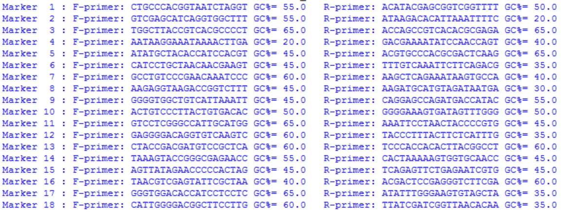
- Molecular tests: this is the genomic detection-based method to detect genetic material of the virus using the PCR technology, thus it's also called a PCR test, nucleic acid amplification test (NAAT) or,
simply, gene test. It is done by collecting fluid from a nasal, throat swab or saliva. Then, a pair of PCR primers designed from the viral genome (ORFs), for instance, Forward Primer (GAC CCC AAA ATC AGC GAA AT) and Reverse Primer
(TCT GGT TAC TGC CAG TTG AAT CTG), are used to generate an amplicon from the viral genome which is further detected by the machine using fluorescence marker. This method is able to detect active covid-19 infection.
- Antigen tests: this test can detect specific proteins on the surface of the virus and produce rapid results in an hour or less. So, it is faster and less expensive than the molecular/PCR tests. A fluid sample can be collected for testing using a nasal or throat swab. This test can also diagnoses active covid-19 infection.
- Antibody testing: this is the test to detect the presence of antibodies that are produced by the immune system to fight infections in response to the virus. It may take several days or weeks to develop antibodies after the infection which could stay in the blood for several weeks or more after recovery.
A sample is collected using finger stick or blood draw. This test can only conclude if a person was infected by the virus in the past (FDA, 2020). Therefore, we should not use antibody tests to diagnose an active covid-19 infection.
COVID-19 vaccines: in addition to using masks and social distancing, the following three main types of vaccines can be used to prompt our bodies to work with the immune system in order to best protect people from the virus that causes COVID-19 pandemic,
including: (1) mRNA vaccine, (2) protein subunit vaccine, and (3) vector vaccine.
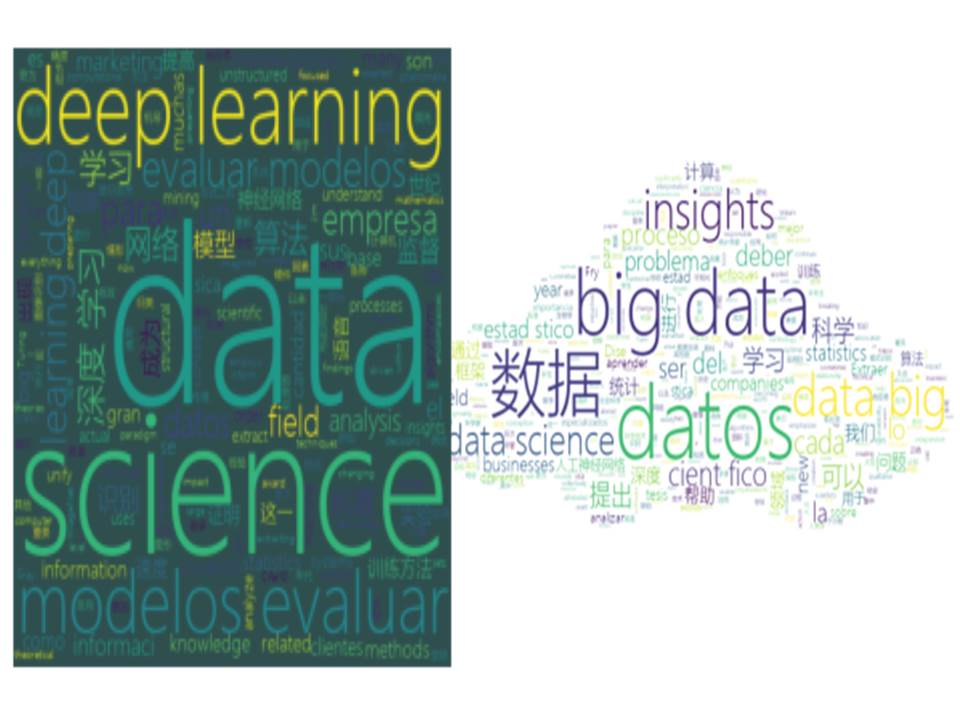 A word cloud generated through text mining using python.
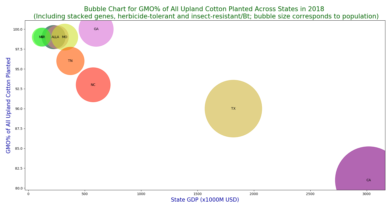 A bubble chart for GMO% of all upland cotton planted across USA in 2018.
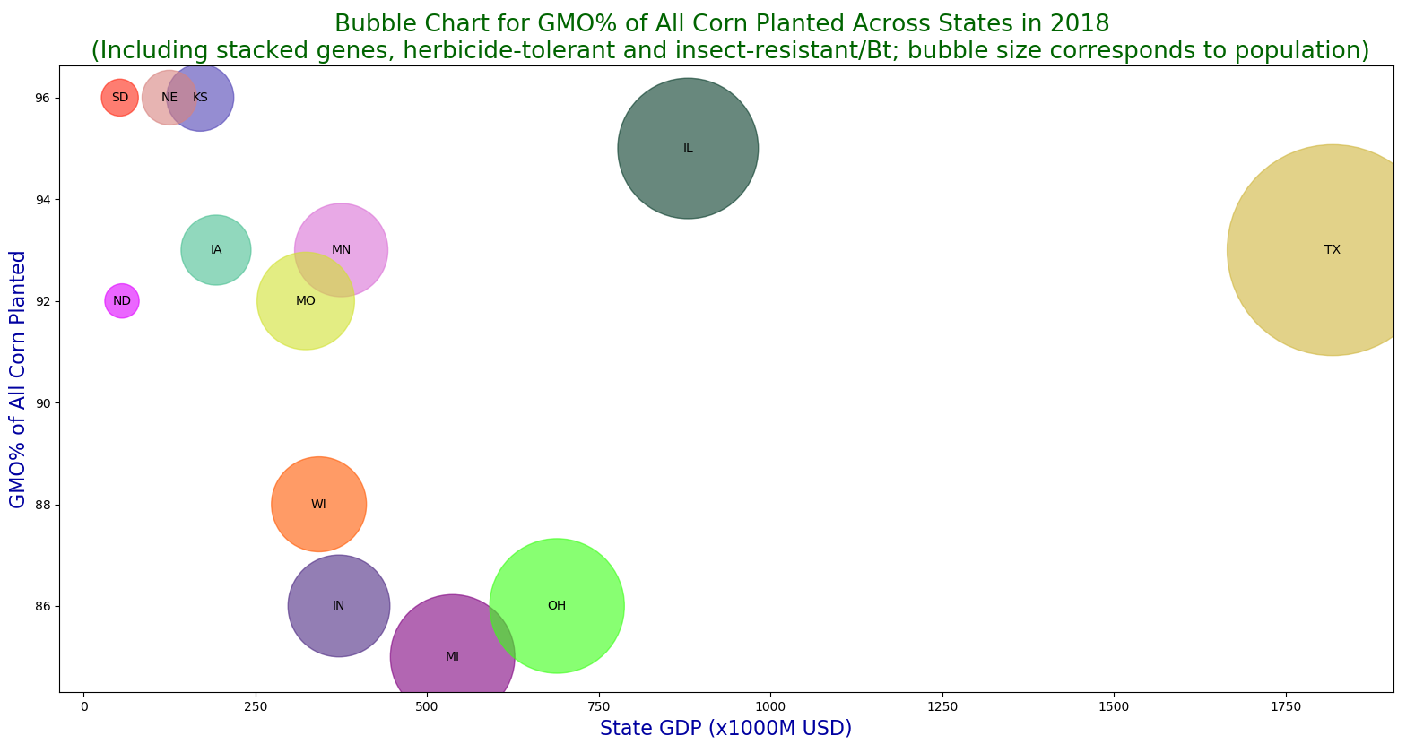 A bubble chart for GMO% of all corn planted across USA in 2018.
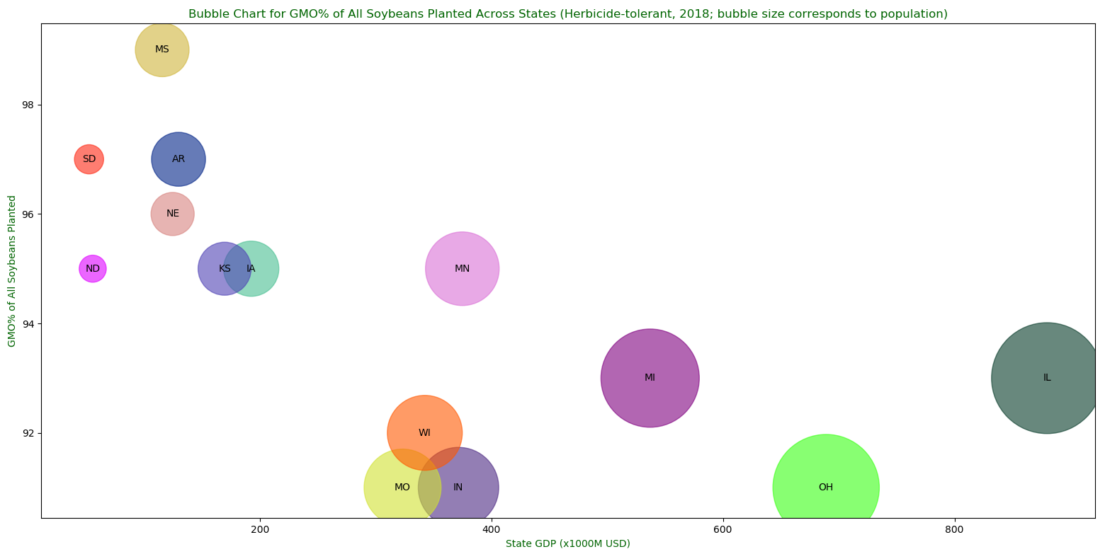 A bubble chart for GMO% of all soybeans planted across USA in 2018.