R Programming

R basics

R is a free programming language and software environment for statistical computing and graphics that is supported by the R Foundation for Statistical Computing. The R language is widely used among statisticians and data miners for developing statistical software and data analysis.

This is simply an introduction on using R for computational genomics. It is aimed at wet-lab researchers who wants to use R in their data analysis ,and bioinformaticians who are new to R and wants to learn more about its capabilities for genomics data analysis. As new high-throughout experimental techniques on the rise, data analysis capabilities are sought-after features for researchers. R, with its statistical heritage, plotting features and rich user-contributed packages is one of the best languages for the task of analyzing data.

R has become more and more important software language for carrying out both simple and complicated statistical analyses, including:

  • Data summary and exploration
  • Graphical presentation
  • Data modelling

R is considered as one of the most effective environment and language for manipulating and analyzing data in statistics. It can generate graphics with high quality for publication including relevant formulae and mathematical symbols.

Unlike other statistical softwares, R stores information and operates on objects, such as scalars, vectors, matrices, lists and dataframes etc. It is very useful to define new types of object to target particular applications. One of R's essential features is that it will do different things for different types of objects.

Machine learning and artificial intelligence

Apart from being one of the important general purpose languages, R also has many packages such as Gmodels, RODBC, Class and Tm that can be used for machine learning and artificial intelligence. The packages can facilitate and implement the machine learning algorithms solve the business oriented problems (Machine Learning with R, 2017).

The Git Statistics of the Most Popular R Libraries (2018)

Like Python, R is another important and popular tool for data sciences that is mainly designed for statistical computing. R has been well developed with thousands of packages to solve a lot of problems in data analysis. Listed below are the most important R libraries and packages in 2018 summarized from the github site by the ActiveWizards. The most popular libraries include dplyr, ggplot2, plotly, knitr and XGBoost based on the number of commits and contributors suited for data manipulation, visualization, competitive research as well as machine learning.

A list of the top 20 R libraries from GitHub:
rlibraries


R Applications


Text mining analytics

Text mining analytics is used to identify and highlight the most frequently used keywords from an existing environment such as article or a web page. It aims to process raw information to bring out meaningful insights.

A word cloud, and the like, is a graphical display of frequently used words in a collection of text derived from documents or websites, which demonstrates the frequency of words by their font sizes for simple visualization. It is ideal for a quick and qualitative view of information to grasp attention. Thus, it has its advantages of being (1) clarity on what stands out, (2) communicative tool with impact, and (3) a simple art with special visual effects.

Users of a word cloud are across many different fields including data scientists for quick visualization and reports of qualitative data. A word cloud can be generated using some of the R packages including a text mining package (tm) and a generator package (wordcloud) or Python.


RNA-seq data analysis

Since the availability of the next-generation sequencing (NGS) technology, RNA-seq has become popular in biological research in many species for gene discovery, annotation and expression analysis along with the identification of SNP markers across a genome. Compared with the previous DNA microarray technology, it can provide a comprehensive overview of transcriptome with some of the great advantages including higher sensitivity, higher resolution at nucleotide level and no prerequisite of gene sequences. The advances in high-throughput sequencing with decreasing cost have made it affordable to rapidly generate a large quantity of DNA sequences and genotypic data for investigating a wide range of biological and medical problems. In the meantime, massive and complex sequence datasets generated from the sequencers create a need for the development of statistical and bio-computational applications to tackle the analysis and data management.

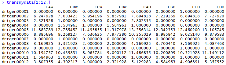
Here is a hypothetical example of RNA-Seq dataset from the drought experiment with hybrid maize, i.e. drought stress vs optimal water supply. Samples were sequenced with short reads being mapped onto the maize reference genome and the number of reads mapped to the features of interest (genic regions) were obtained. The gene expression profile for a particular sample consists of the set of gene-wise counts of sequence reads from that sample and one of the experimental objectives is to identify the differentially expressed genes.

As the distribution of direct count data is highly skewed, a log2 transformation can approximately normalize the distributions as indicated below:


where, C is the count data while is a small positive constant (“1", for instance) to facilitate the computation of the logarithm value in case of zero count for some conditions.

The following table lists the top 12 rows of transformed data from the drought experiments: datatable

The data set should be performed with additional manipulations to filter and exclude the genes with non-differential expression. A simple scatter plot can be generated using the script below prior to the differential gene expression analysis.


					ggplot(data=mydata, aes(x = CAW, y = CAD, color=CBD)) +
					  geom_point(size=3) +
					  labs(title="Scatterplot of log2 transformed gene expression data \nfrom the drought experiment of hybrid corn", x= "Log2 gene expression for CAW", y="Log2 gene expression for CAD") +
					  theme(
					    plot.title = element_text(color="#0000ff", hjust = 0.5, size=13, face="bold"),
					    axis.title.x = element_text(color="#003366", size=12, face="bold"),
					    axis.title.y = element_text(color="#003366", size=12, face="bold"))
					

Then, an MA plot for differential expression analysis can be created to visualize the differences between measurements obtained from two samples or treatments based on the log-intensity ratio (M) and the average log-expression (A).


where, and are the expression data for sample 1 and 2, respectively.


					ggplot(data=mydata, aes(x = A, y = M, color=CBD)) +
				         geom_point(size=3) +
				         labs(title="MA-plot for log2 transformed gene expression data \nfrom the drought experiment of hybrid corn", x= "Log2 mean expression", y="Log2 fold change\n(drought condition vs optimal water supply)") +
				         theme(
				         plot.title = element_text(color="#0000ff", hjust = 0.5, size=13, face="bold"),
				         axis.title.x = element_text(color="#003366", size=12, face="bold"),
				         axis.title.y = element_text(color="#003366", size=12, face="bold"))
					

To generate a heatmap for clustering gene expression leveles across samples and treatments:

					library(stats)
					library(gplots)
					heatmap.2(as.matrix(mydata), col=redgreen(95), scale="row", key=T, keysize=1.5,density.info="none",
					      trace="none", cexCol=0.9, labRow=NA)
					

The transformed dataset can be normalized using the following approach (minmax normalization):


where, and are the data before and after normalization, respectively.

Thus, a heatmap of similarities can also be created among the participating genotypes based on the expressed genes under different treatment conditions:


					library(RColorBrewer)
					mydata = as.matrix(dist(t(mydata)))
					mydata = (mydata - min(mydata))/(max(mydata) - min(mydata))
					hmcol = colorRampPalette(brewer.pal(9, "GnBu"))(100)
					heatmap(mydata, col=hmcol)
					

Chord diagram: an elite inbred and its multiple hybrids

Multiple high-yielding commercial hybrids produced from an elite inbred:


					#corn inbred and yield
					library(circlize)
					mydata=read.table("...mydata.csv", sep=",")
					colnames(mydata)=c("FIL0a",	"SYT1",	"SYT2",	"SYT3")
					rownames(mydata)=c("FIL0a",	"SYT1",	"SYT2",	"SYT3")
					mat=data.matrix(mydata)
					chordDiagram(mat)
					

Chord diagram: the SNF genic contributions to phenotypes

The chord diagram from R is created for the genic contributions to phenotypic traits, such as biomass, protein or yield, from the main orthologs of the symbiotic nitrogen fixation (SNF) based on the averages of their gene expression levels.

Assumed that line1 (L1) contains the gene Medtr1g062620, L2 contains Medtr3g077720, L3 contains Medtr5g014820, L4 contains Medtr1g062620 and Medtr3g077720, L5 contains Medtr1g062620 and Medtr5g014820, L6 contains Medtr3g077720 and Medtr5g014820, L7 contains Medtr1g062620, Medtr3g077720 and Medtr5g014820.

					#Chord diagram for the hypothetical contribution to yield from the orthologs responsible for symbiotic nitrogen fixation (SNF)
					library(circlize)
					mydata=read.table("...mydata.csv", sep=",")
					colnames(mydata)=c("L1", "L2",	"L3",	"L4",	"L5",	"L6",	"L7")
					rownames(mydata)=c("L1", "L2",	"L3",	"L4",	"L5",	"L6",	"L7")
					mat=data.matrix(mydata)
					chordDiagram(mat)
					

Graphical display of a correlation matrix of soybean traits


					library(tidyverse)
					library(data.table)
					library(corrplot)
					soydata<- read.csv("sdata.csv")
					trtdata <- select(soydata, yield, disRes, height, lodging, seedwt, protein, oil, sumpo)
					matrix <- cor(trtdata);
					corrplot(matrix, method="color", type="upper")
					

Creating regression charts between crop traits


					library(ggplot2)
					library(gridExtra)
					c1a <- ggplot(soydata, aes(x = disRes, y = yield)) +
								geom_point(aes(size=3, color="red") + geom_smooth(method = "lm", se = TRUE))
					c1b <- c1a + theme(axis.title.x = element_text(face="bold", size=12)) + labs(x="Disease
								Rating") + theme(axis.title.y = element_text(face="bold", size=12)) + labs(y="Yield") + theme(plot.title = element_text(face="bold", size=12)) + labs(title="Yield Response to Root Disease") + theme(panel.grid.major = element_blank(), panel.border = element_blank(), panel.background = element_blank(), axis.line = element_line(size=.4))
					m1 <- lm(soydata$yield ~ soydata$disRes)
					a1 <- signif(coef(m1)[1], digits = 2)
					b1 <- signif(coef(m1)[2], digits = 2)
					regeq1 <- paste("y = ",b1,"x + ",a1, sep="")
					regression1 <- c1b + geom_text(aes(x = 6, y = 360, label = regeq1), color="black", size=5,
						parse = FALSE)
					grid.arrange(r1, r2, nrow=1)
					

Scatterplot matrices for soybean traits by correlation


					library(gclus)
					trtdata.r <- abs(cor(trtdata))
					trtdata.col <- dmat.color(trtdata.r)
					trtdata.o <- order.single(trtdata.r)
					cpairs(trtdata, trtdata.o, panel.colors=trtdata.col, gap=0.3,
					       main="Scatterplot Matrices for Soybean Traits by Correlation")
					

Simple plotting


					(A)
x<-1:500
y<-sin(x/10) * exp(x * -0.01)
plot(x, y, col="#308866") #plot the dependent variable vs the independent variable.
title(main="Simple plotting (A)", col.main="#000080")
(B)
x<-1:500
y<-sin(x/80) * exp(x * -0.001)
plot(x, y, col="#308866") #plot the dependent variable vs the independent variable.
title(main="Simple plotting (B)", col.main="#000080")